👁️ + 👉🏽
Milaap_1-08.jpg

Disrupting behaviors

Milaap at its core


For my Final Year Graduation Project, I had the opportunity to work with Milaap - India's largest crowdfunding platform for social and personal causes, and help with redesigning the experience and interface of some of the features on their website. In the process of standardising and unifying the experience, the website underwent a complete overhaul. More details about Milaap, like who they are, what they do and how they do it, can be found here


As mentioned at the end of the previous project, Milaap's visited website is visited and utilised for different purposes. Therefore, purely on the basis of utilisation, the website's features can be classified under 3 categories and each of these categories is covered as separate projects. In this project, I will go into the details 


How do fundraiser organisers use Milaap?


This task flow diagram charts how a Fundraiser Organiser navigates through the website and with what objective.


Homepage


The purpose of a homepage should be to provide users with information to help you achieve the organisation's mission. Milaap's soul purpose is to help hardworking beneficiaries by connecting them to individuals who want to help them monetarily. In order to start a fundraiser on Milaap, the user must first visit the homepage.  When designing the homepage, we had 2 clear agendas.

1. The Call To Action had to be compelling and clear.  

2. The interface should be simple, so as not to discourage a relatively non-tech-savvy user by overwhelming them.

Keeping these in mind we started the brainstorming session.


Card sorting exercises and rough wire-framing helped us freeze the information architecture of the homepage.


Design

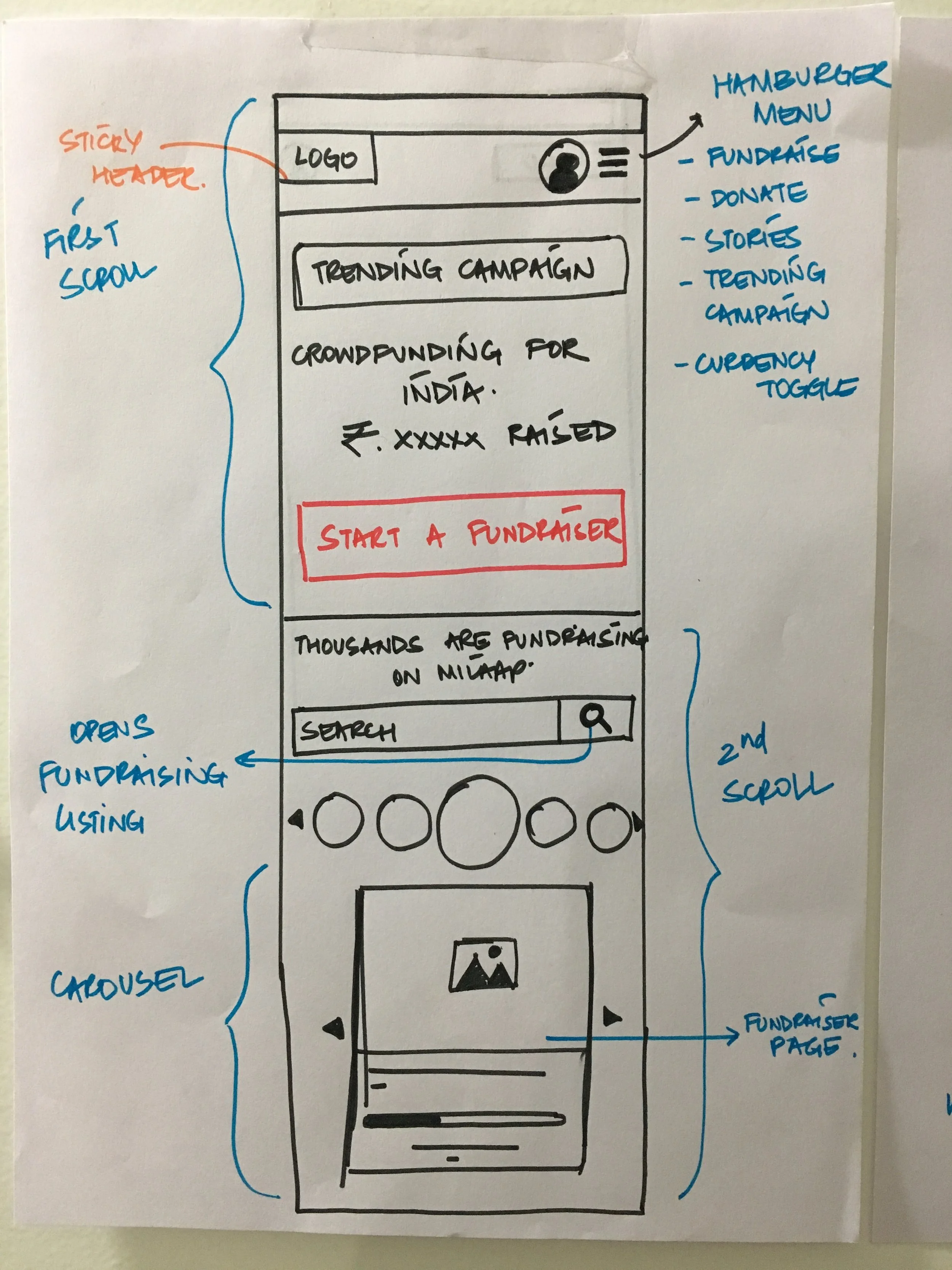
Having the "Start a fundraiser" CTA in the first scroll was a very carefully calculated decision, we did not want to waste crucial time of the users, nor did we want to overwhelm them with too many options. 

In the second scroll, users can find fundraisers started by other people. By looking at the minimal fundraiser cards, users can have a better understanding of the cause of the fundraiser, how much money it has raised and who is the fundraising individual - all the information that can make a new fundraiser organisers feel confident about starting their own fundraiser. Each icon in the icons strip represents a cause for which a fundraiser has been started on Milaap. By clicking on any one of the icons, users are redirected to a listing page of the fundraisers filed under that cause. In a nutshell, this section of the homepage is meant to address any anxieties or trust-issues that potential fundraiser organisers might have. 

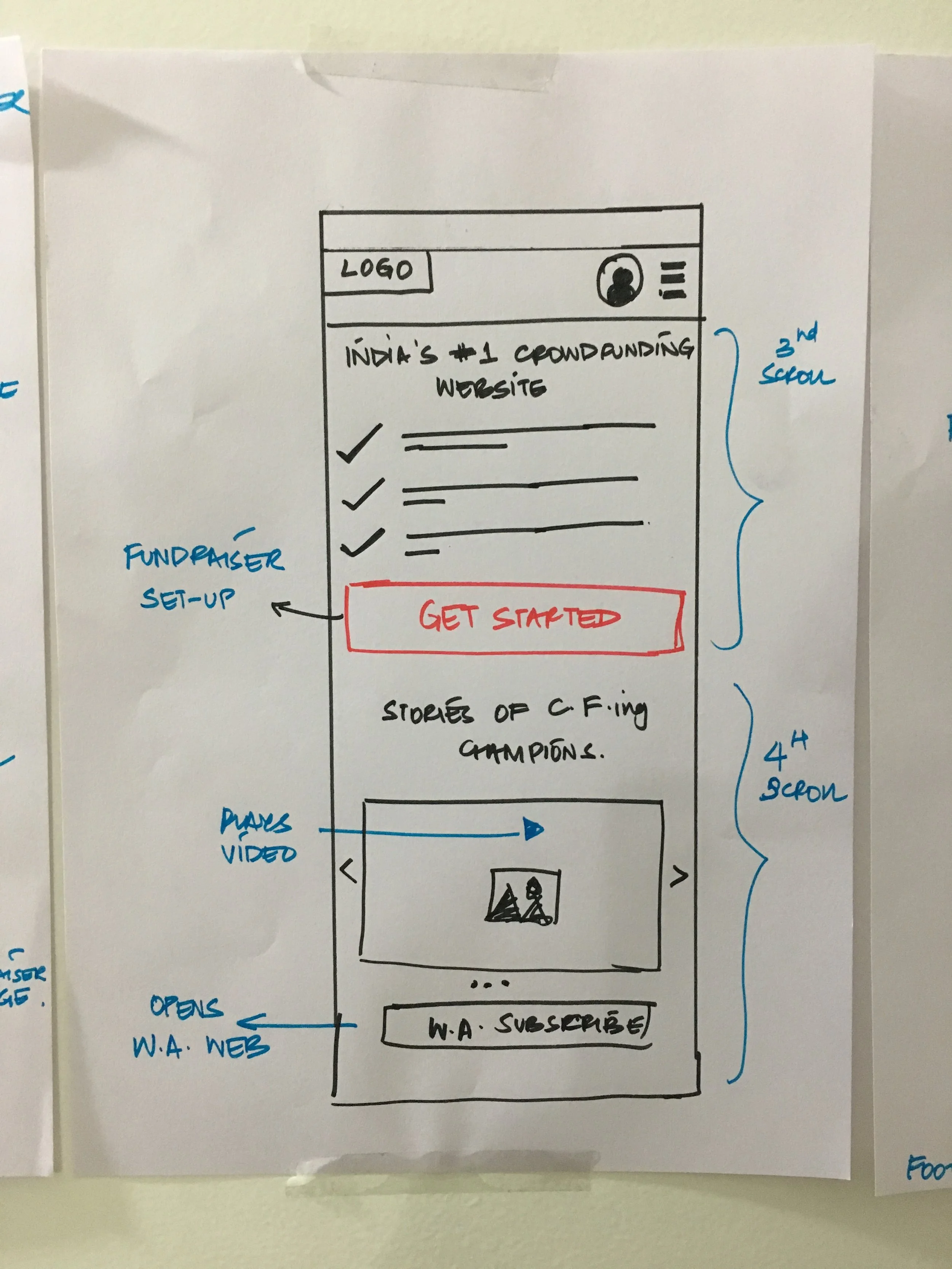
The next section lists all the benefits of starting a fundraiser on Milaap.


Campaign set-up


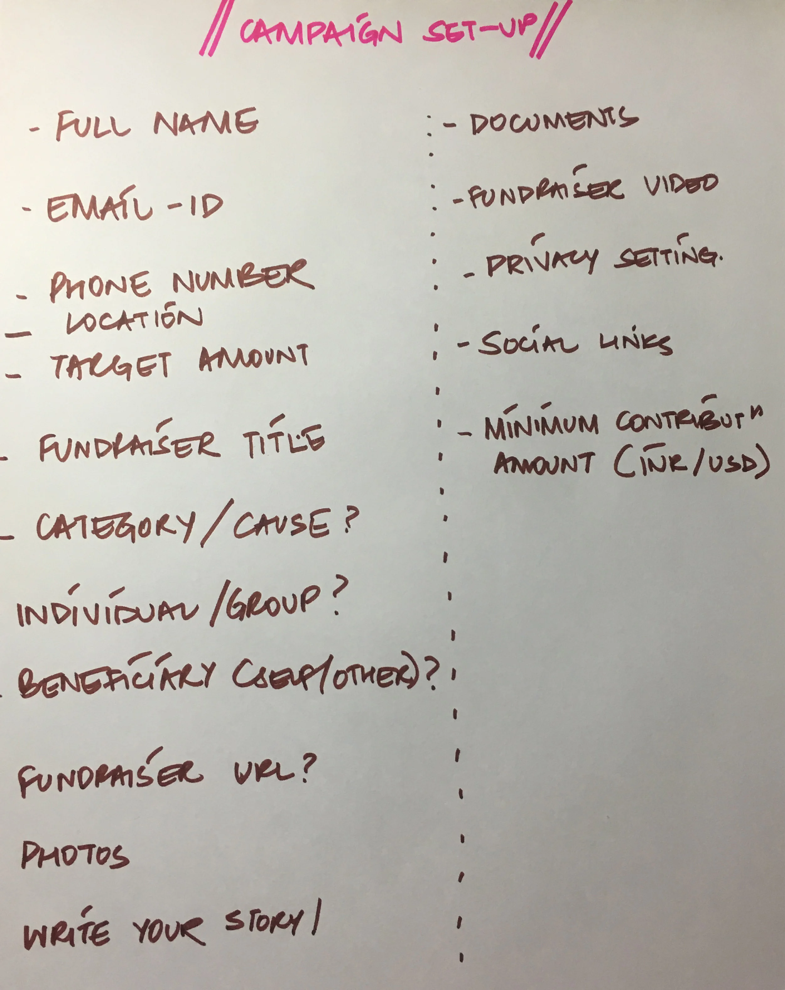
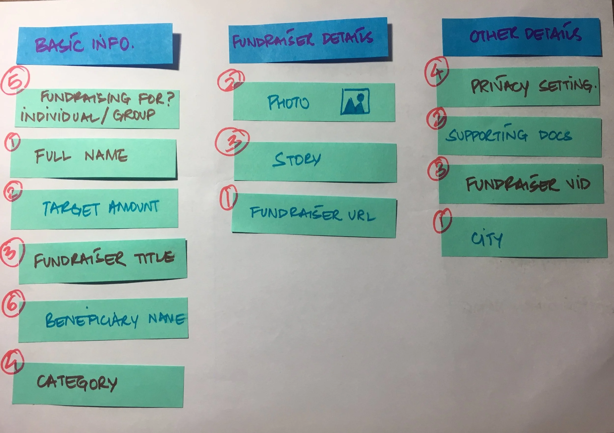
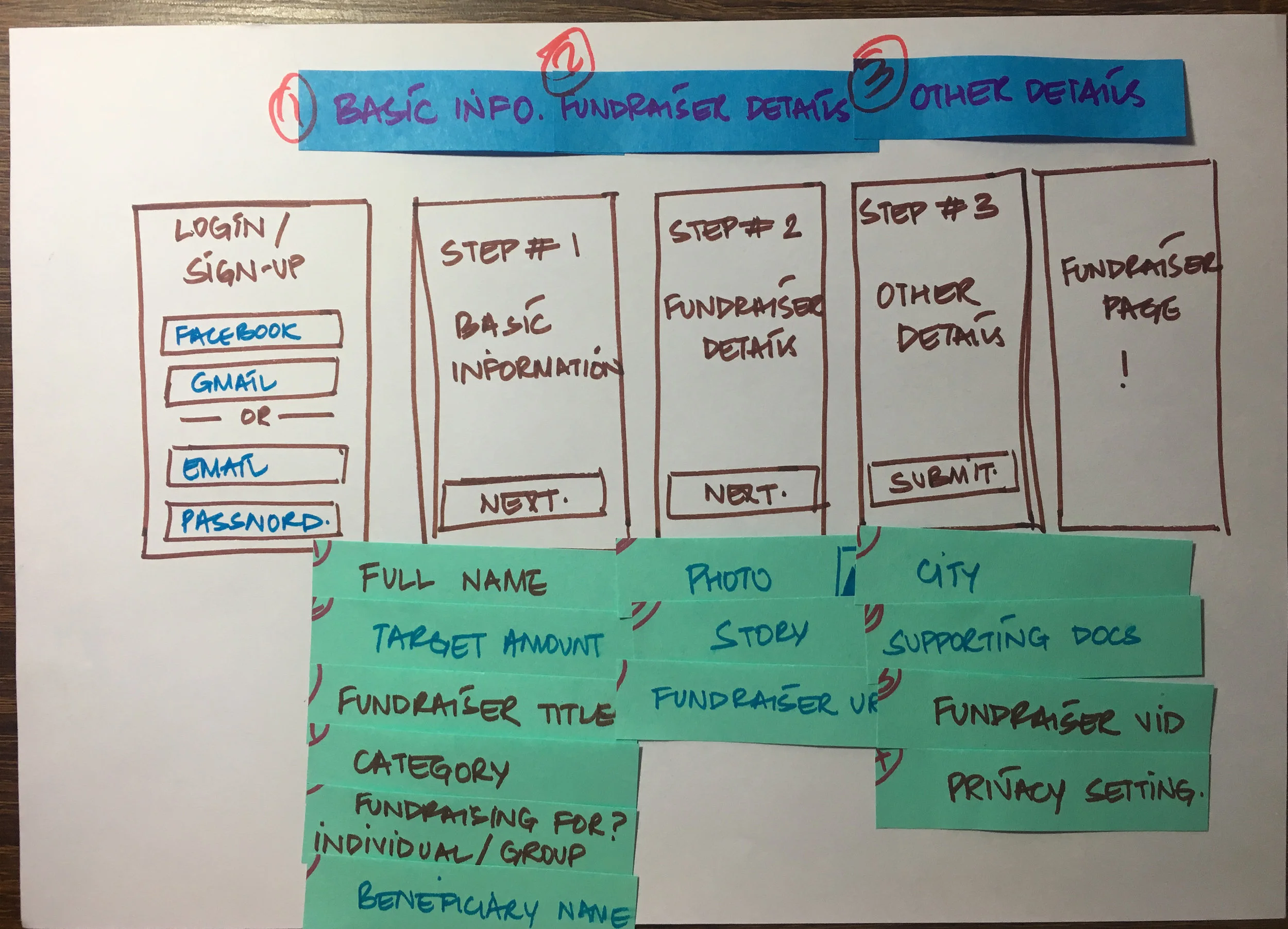
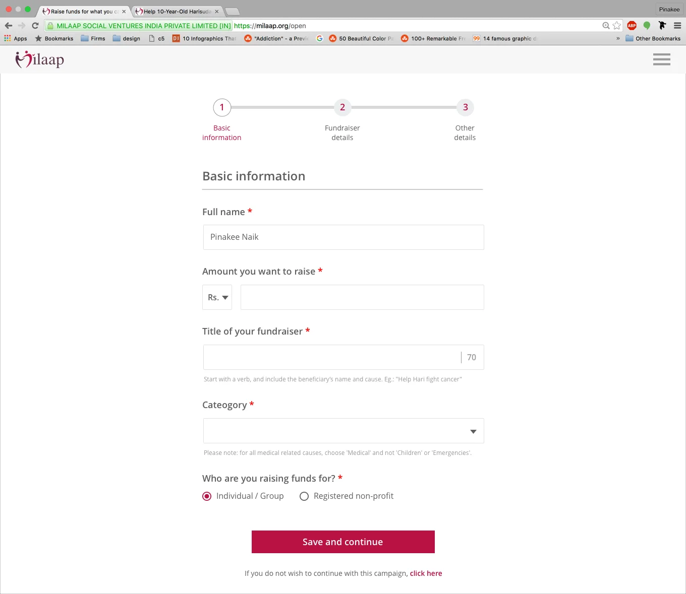
Once the user has made the decision to start a fundraiser, they are directed to the fundraiser set-up flow. To encourage more users to start a fundraiser on Milaap, we had to reduce the time it took to set up a fundraiser to the minimum. To achieve this, we constantly kept revising the list of questions we would ask the organisers and ensured that we were asking them only the bare minimum questions.